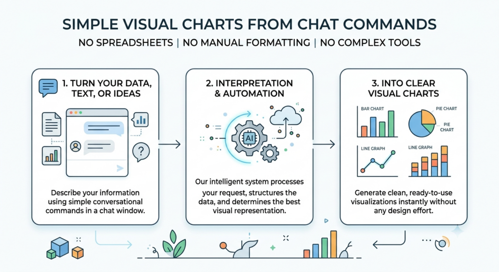
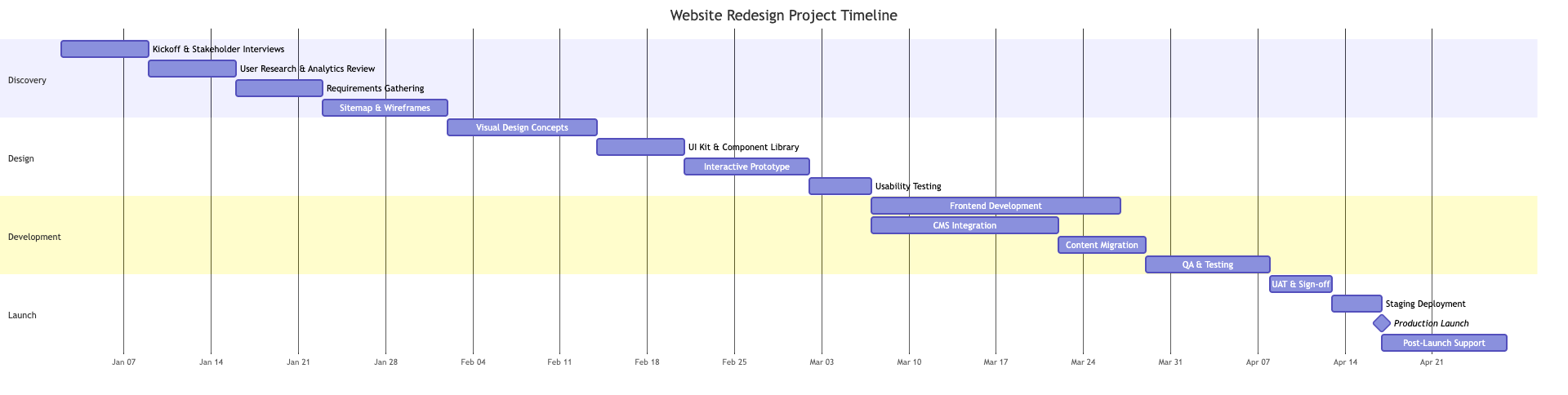
Turn your data, text, or ideas into clear visual charts using simple chat commands. No spreadsheets, manual formatting, or complex design tools required.
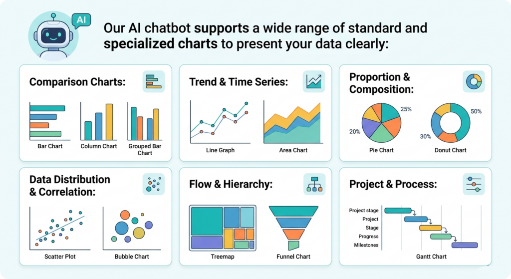
Supported Chart Types
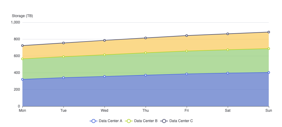
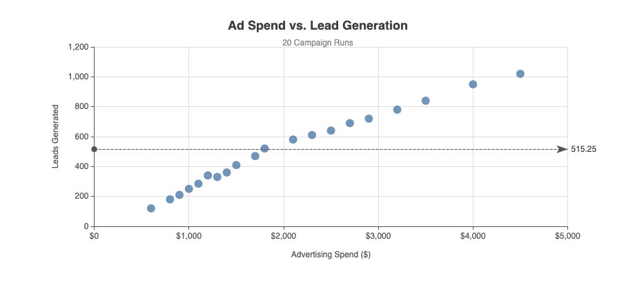
Our AI Chatbot supports a wide range of standard and specialized charts to present your data clearly:
The real magic happens after your chart is created. Traditional software forces you to start over or manually rebuild your chart when data changes or your boss asks for a different layout.
With our chatbot, editing is an ongoing conversation. Need to tweak something? Simply reply with simple commands like:
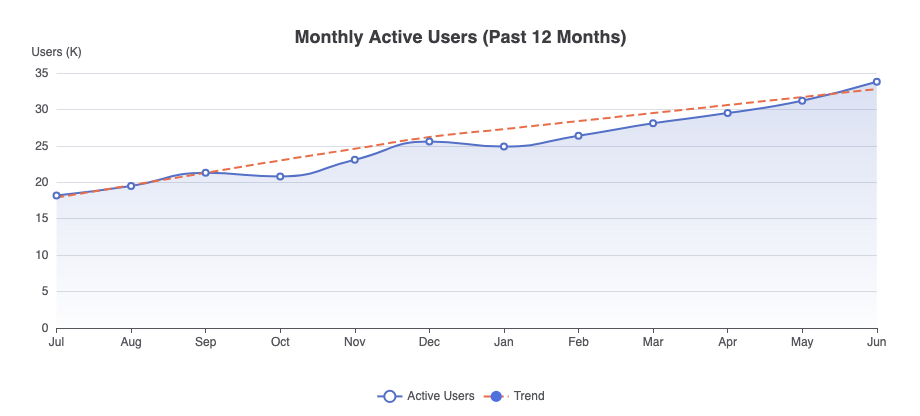
“Add 2026 projections to this line graph.”
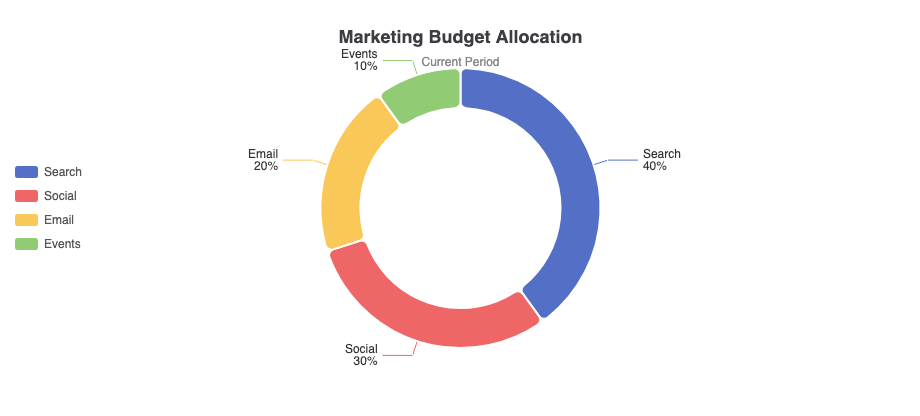
“Switch this to a donut chart and highlight our top region.”
“Filter out low-performing categories and sort high to low.”
The AI listens, understands the context of your previous inputs, and updates your graphic instantly—saving you hours of tedious manual formatting.
Why Choose Our AI Chart Generator?
Creating professional charts shouldn’t mean fighting with spreadsheet formulas or wrestling with complex design software. Our AI Chatbot combines the flexibility of natural language with enterprise-grade ECharts rendering, giving you presentation-ready visuals in seconds through simple conversation.
Natural Chat Edits
Change labels, swap colors, add new data, or switch chart types just by chatting—no need to dig through submenus.
Smart Type Recommendation
Unsure which chart works best? Give the chatbot your raw text or table, and it picks the best layout for your data automatically.
No Formatting Hassle
Skip the manual adjustments. The AI automatically handles spacing, labels, and clean layouts so your visual is presentation-ready right away.
Seamless Workflow Integration
Export ready-to-share visuals for your reports and OpenDocs, or fine-tune them in VPasCode with full code control.
Examples of Generating Chart
Use simple text prompts to generate this diagram in seconds. Here are a few examples to get you started:
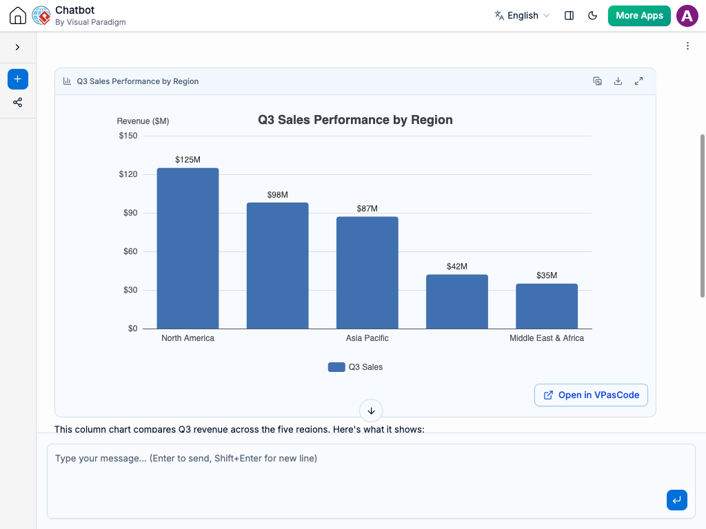
Regional Sales Performance Comparison (Bar Chart)
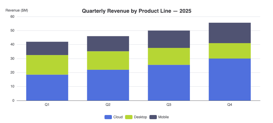
“Create a stacked column chart showing quarterly revenue split by product line (Cloud, Desktop, Mobile) for 2025.”
Turn your data, text, or ideas into clear visual charts using simple chat commands. No spreadsheets, manual formatting, or complex design tools required.