


Microservices have become a leading architectural choice for building scalable, flexible systems. But with so many independently deployed services, containers, clusters, and communication channels, visualizing the full runtime environment can quickly become overwhelming. This is where a UML Deployment Diagram becomes extremely valuable.
A deployment diagram provides a clear, structured view of how microservices are deployed, how they interact, and how the infrastructure supports the entire ecosystem. Whether you are designing a new microservices platform or documenting an existing one, this type of diagram helps you simplify complexity and communicate architecture decisions effectively.
Why Deployment Diagrams Matter in Microservices
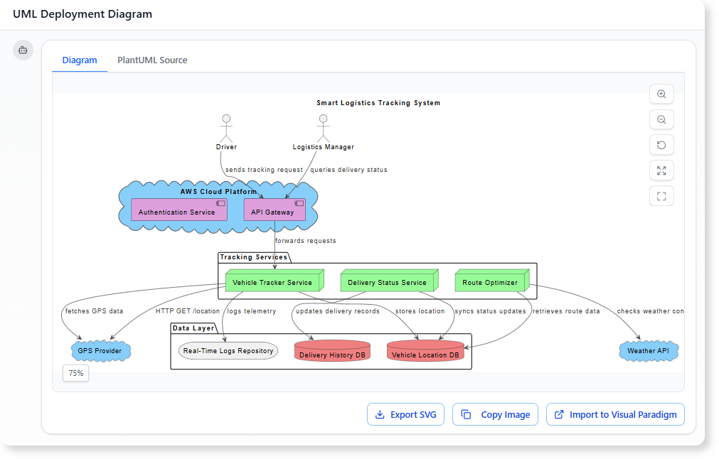
Microservices architecture is distributed by nature. Each service has its own runtime, scalability pattern, network rules, and dependencies. A deployment diagram brings order to this complexity by showing the physical and virtual environment where everything runs.
Here is why this matters:
1. Clarifies System-Wide Infrastructure
Microservices rely on clusters, container orchestrators, gateways, message brokers, caches, and databases. A deployment diagram maps all these elements clearly, reducing guesswork during development and onboarding.
2. Reveals Communication Flows
By visualizing HTTP routes, event streams, message queues, and internal service calls, you gain a better understanding of how the system behaves in production.
3. Supports Scalability and Load Planning
Each microservice often requires its own scaling strategy. Deployment diagrams help teams understand which components are replicated, how load balancers are used, and which nodes may become performance bottlenecks.
4. Helps Analyze Fault Tolerance
Redundant pods, replica sets, broker clusters, and fallback paths become easier to identify when deployment details are clearly mapped out.
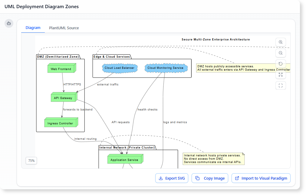
5. Improves Security and Boundary Management
You can illustrate zones such as DMZ, internal networks, ingress controllers, API gateways, and private clusters—helping you plan and validate security configurations.
Key Elements Typically Found in a Microservices Deployment Diagram
A realistic deployment diagram for microservices usually includes:
- Containers and Pods: The smallest deployable units—Docker containers, Kubernetes pods, or equivalent.
- Clusters: Kubernetes clusters, ECS clusters, or service meshes that host microservices.
- API Gateway :The entry point for all external requests.
- Service Instances: Independently deployed microservices with their own runtime environments.
- Message Brokers: Kafka, RabbitMQ, Google Pub/Sub, or AWS SNS/SQS for asynchronous communication.
- Databases and Storage: Each microservice may have its own data store, supporting independent data ownership.
- Load Balancers: Used to distribute traffic across replicas.
- External Integrations: Payment gateways, authentication providers, third-party APIs.
- Communication Paths: REST calls, gRPC, event streams, and asynchronous message routing.
These elements form the backbone of a comprehensive microservices deployment view.
What a Deployment Diagram Helps You Understand
When applied to microservices, a deployment diagram helps answer essential architecture questions:
-
How many replicas of each service exist?
-
Which nodes run which containers?
-
How does traffic enter the system?
-
Which services rely on message queues or event buses?
-
What storage solutions support each service?
-
What are the network boundaries and zones?
-
Where are potential bottlenecks or weaknesses?
This clarity is invaluable for architects, developers, DevOps engineers, and anyone contributing to system evolution.
How AI Tools Make Microservices Deployment Mapping Easier
Manually creating deployment diagrams for microservices can be tedious. You need to map clusters, pods, gateways, databases, brokers, and communication paths—often across multiple iterations.
AI diagram generators simplify this process dramatically:
-
You describe your architecture in plain text.
-
The AI instantly generates a deployment diagram.
-
You refine it with simple chat commands.
-
You can request analysis, such as identifying bottlenecks or redundancies.
-
You can turn the diagram into documentation with one request.
This makes it easy to maintain up-to-date architecture visuals for fast-evolving microservices systems.
Conclusion
A UML Deployment Diagram is one of the most practical tools for understanding microservices architecture. It captures how services run in containers, how clusters are organized, how communication flows across the ecosystem, and how supporting components such as caches, brokers, and databases fit into the infrastructure.
In a landscape where services evolve independently and deployments change frequently, clear visualization is critical. Deployment diagrams make microservices architecture easier to design, explain, scale, secure, and maintain.